
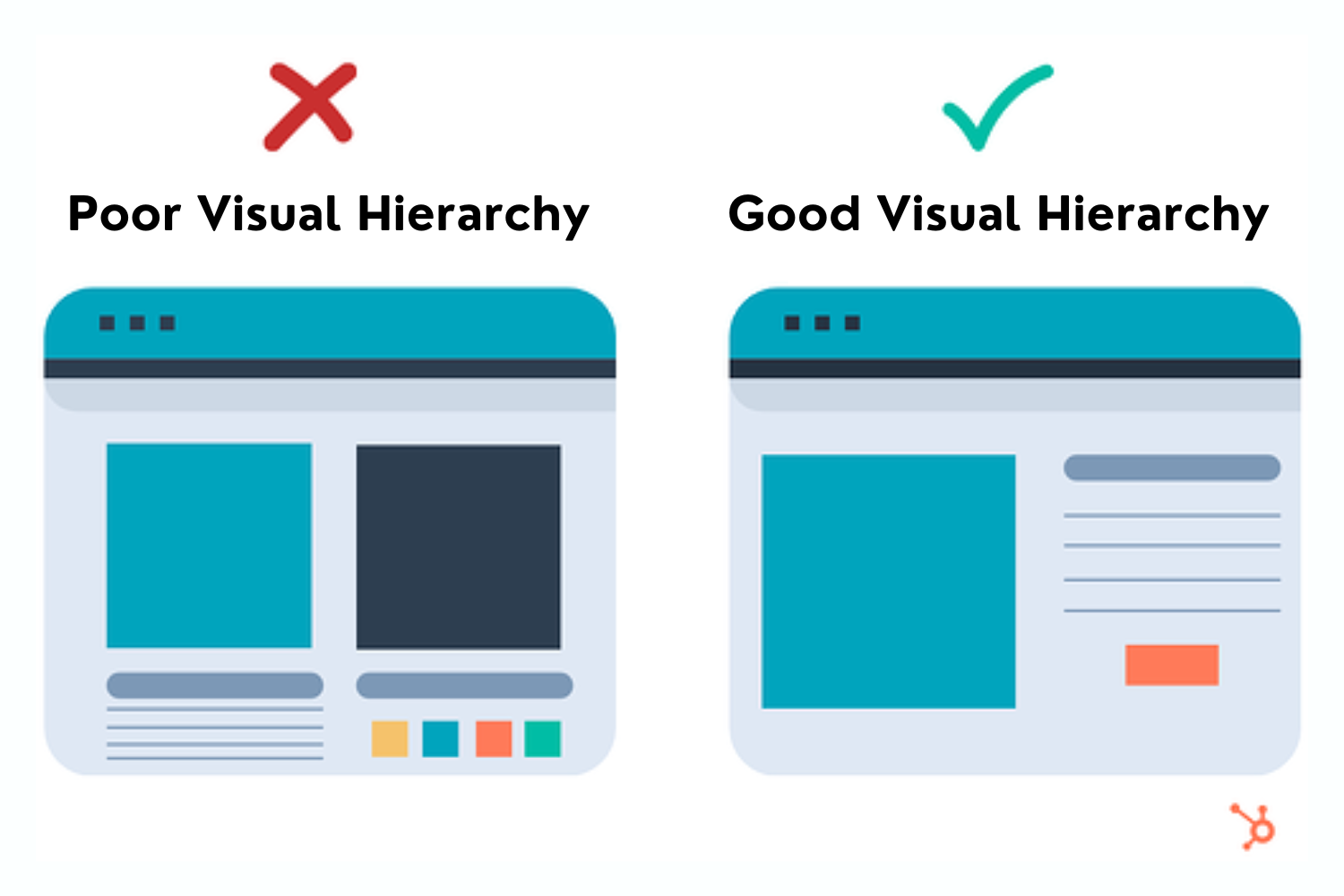
Have you ever encountered a web page that looks extremely cluttered and finds it challenging to start looking? If you are worried about seeing too many design elements without any focus, the layout likely needs proper visual hierarchy. As technology evolves daily, a designer’s role is to ensure that the content reaches its audience in a non-chaotic and transparent way.
Every webpage should be able to tell a compelling story to its users by combining visual hierarchy with fonts. Not only does it looks visually appealing, but it also has a lasting impact on the overall user experience. In addition, when the structure is concise and clear, it is easier for users to navigate and deduce the information they are looking for without chaos.
To provide a delightful user experience, you must start by understanding your user group. This article looks at the importance of visual hierarchy in UX and its five fundamental principles.
Visual hierarchy is a fundamental concept in UX design. It refers to the arrangement and structure of the design elements to highlight them in order of their importance to your user. The idea behind this concept is that you want your viewers to primarily pay attention to the most critical part of the content that will provide them value.
The principle involves focusing and manipulating some design elements so that the viewers are drawn more toward them. By focusing on the visual hierarchy, you will control the user’s browsing order through your content. In simple words, visual hierarchy helps you arrange your graphic elements according to their importance for the viewers.
Every aspect gets a weight that reflects its importance. Incorporating visual hierarchy in UX design helps guide your viewer to focus. Visual hierarchy has become the foundation for successful UX. It lets you direct the user's attention but makes content consumption easier.
Visual hierarchy is a critical aspect of your holistic architecture that can make user navigation easier. In today’s digital age, when content is abundant, it is vital not to lose the chance of attracting your user to come back. And this is where visual hierarchy plays an influential role, as it pins down the elements as per their importance and user flow.
The feature can help you organize your content in the same flow as the user consumes it. Ordering your content in the proper flow can make it more comprehensive and valuable for the user. UX design is about making your product more usable, and focusing on the visual hierarchy is critical to removing friction.
It is critical to note that user behavior largely depends on the past interactions that they have had with the products. Having a chaotic visual hierarchy can confuse the consumer and draw their attention to the wrong element of your product. Not only does it make it easier for the users to find what they require, but it also provides them additional time to switch to a competitor.
Consider a scenario where you want a job in your dream company. The first action you take is to google the company and open its webpage. When you reach their webpage, you will likely scroll down to find the “careers” page or any page that can provide more details about the job.
You do this instinctively, expecting the section to be on the home page. But if the careers section were located somewhere else in sub-navigations, it would have taken longer for you to find it. Moreover, high chances are that you would have gotten frustrated and closed the webpage altogether.
The above example illustrates why visual hierarchy is critical in UX design. Let us look at some of the principles of visual hierarchy and how they function to impact user behavior.
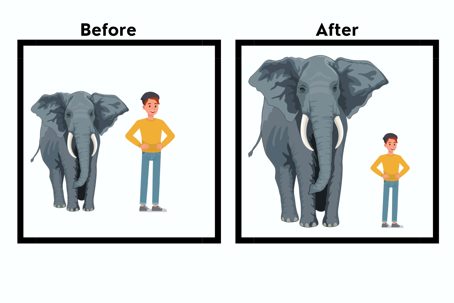
The principle of size and scale are significant in creating a visual hierarchy in UX design. Size is one of the most essential elements but is highly crucial. This is because size and scale are the keys to drawing the attention of your product user. The larger the element is in size, the more attention it will be able to generate. This is because the user automatically considers objects which are large as important. And this is why headlines, titles, and call-to-action buttons are always the most prominent elements within the design.
You should always use scale and size to direct user attention to critical aspects of your content. Once you rank the essential elements of your content, you can size them according to their usability. But you must ensure that you are using it in moderation, as increasing the size of too many elements can reduce the overall importance.
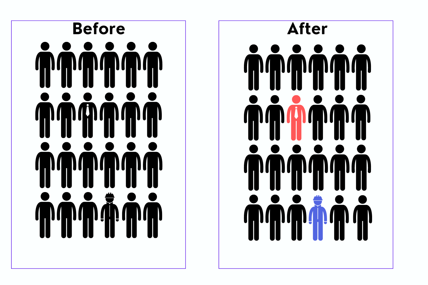
A good UX design uses color and contrast to create a clear visual hierarchy for the page. Using colors properly can highlight some elements while putting some of them in the backdrop. Therefore, using it correctly enables you to color different aspects of your page according to their importance.
If you want to ace your UX design, you have to focus on the contrast. The proper contrast and saturation between the visual elements and their surroundings can help in many ways. Depending on the nearby factors and background, you must be precise about the contrast for the different features.
UX designers often use type contrast to highlight visual hierarchy so that essential elements have unique fonts. Moreover, other techniques, like making the text bold to stand out against the light background, can also be helpful. Finally, styling the text differently than the surrounding element can attract users.
While using color and contrast, you must be careful as it can easily create a negative impact. You should use only a few colors to make the page manageable. Moreover, excessive contrast and saturation can also have adverse effects.
While creating a UX design, ensuring that all the linked elements are in the same proximity region or follow the same path is critical. Grouping similar elements together not only helps the user in finding things quickly but also helps in engaging them better. Furthermore, ensuring that similar items are placed together and in proper alignment can make the content easily scannable and understandable.
While deciding the proximity and grouping of elements, you should note that you must not clutter. Instead, provide ample space for each component so the viewer can comprehend the information without trouble.
Moreover, fair usage of containers can help create an exciting visual hierarchy. You can use additional elements like spacing, borders, or backgrounds to create containers. For example, music apps make different containers having different song playlists and separate them with spacing, white lines, or frames.
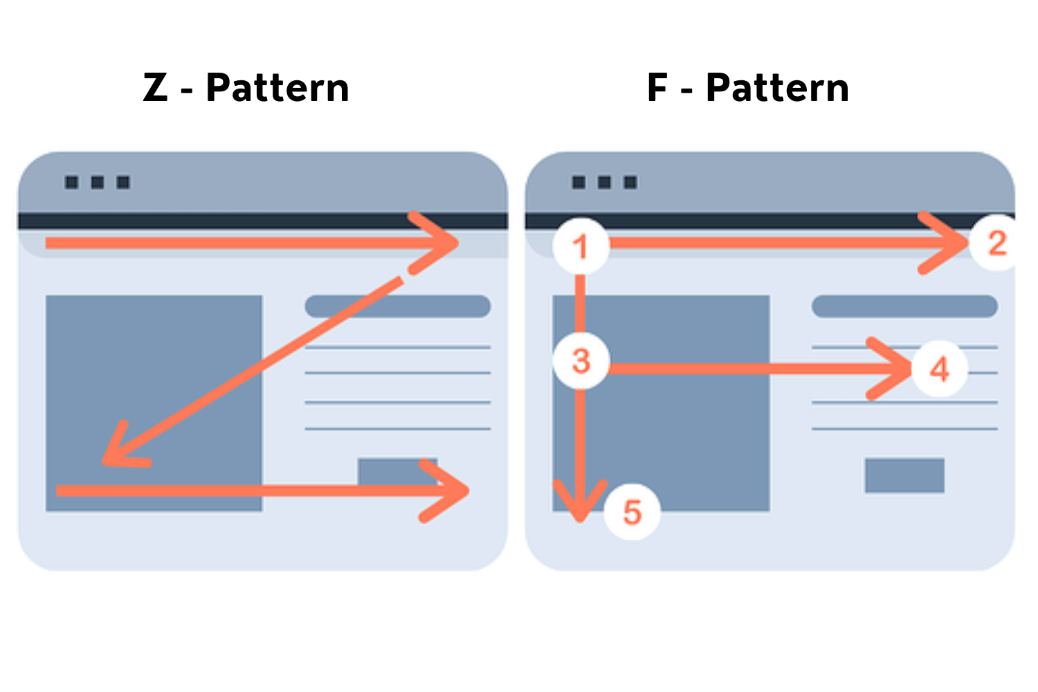
Are you aware that every individual has a viewing pattern that they use to go through any content? The pattern can differ for every person and depends on their viewing content. People use the two most common types of viewing patterns: the F pattern and the Z pattern. It is critical to note that both patterns serve a unique purpose to viewers depending on the content they are viewing. Designing your content while keeping these patterns in mind can give your user a better experience.
If your page is too heavy for viewers, the F-shaped pattern will be more suitable for viewers. In this pattern, the user goes from top left to top right and continues going from left to right sequentially. It aligns with the reading direction of most languages in the world. If your content consists of text, the F pattern is ideal for your visual hierarchy.
The Z pattern follows the sequence of the English alphabet “Z.” It starts on the top left corner and moves to the top right, then to the bottom left, and then bottom right. The pattern is best suited for a page not heavy on content. Using this pattern will let your user browse through the different elements of your webpage conveniently.
Effective utilization of typefaces can allow your webpage to have its personality. Moreover, it can help captivate the user’s attention in certain areas. Using typefaces with different styles and weights can help ensure that some elements of your content stand out.
For example, most content pages use headings of different sizes to indicate the importance and denote the associated content. Therefore, using H1, H2, H3, and so on can give the user the proper hierarchy to browse through content. Furthermore, using unique and effective typefaces for your call-to-action can attract more attention of the user to click.
Font size and weight can capture the audience’s interest and guide them through your content. For example, heavy fonts with more contrast will likely catch the users’ attention first, followed by other content.

Understanding the significance of visual hierarchy in UX design can be beneficial if you want to ensure that your users have the best experience. However, there are different fundamental principles that you must consider while working on the hierarchy, and it is critical to note that the above list needs to be more comprehensive.
Visual hierarchies that need to be clarified can frustrate users, enticing them to leave your page without achieving their goals. However, if you follow and use the above principles of visual hierarchy during designing, your viewers will get the information they need without chaos.
It would be best to define your visual hierarchy before starting your design. Once the elements are ready, you can try experimenting with different principles and find the most suitable for your page. It is always advisable to step into the shoes of your targeted user and see if browsing around your page is hassle-free and if the correct information is easy to extract.