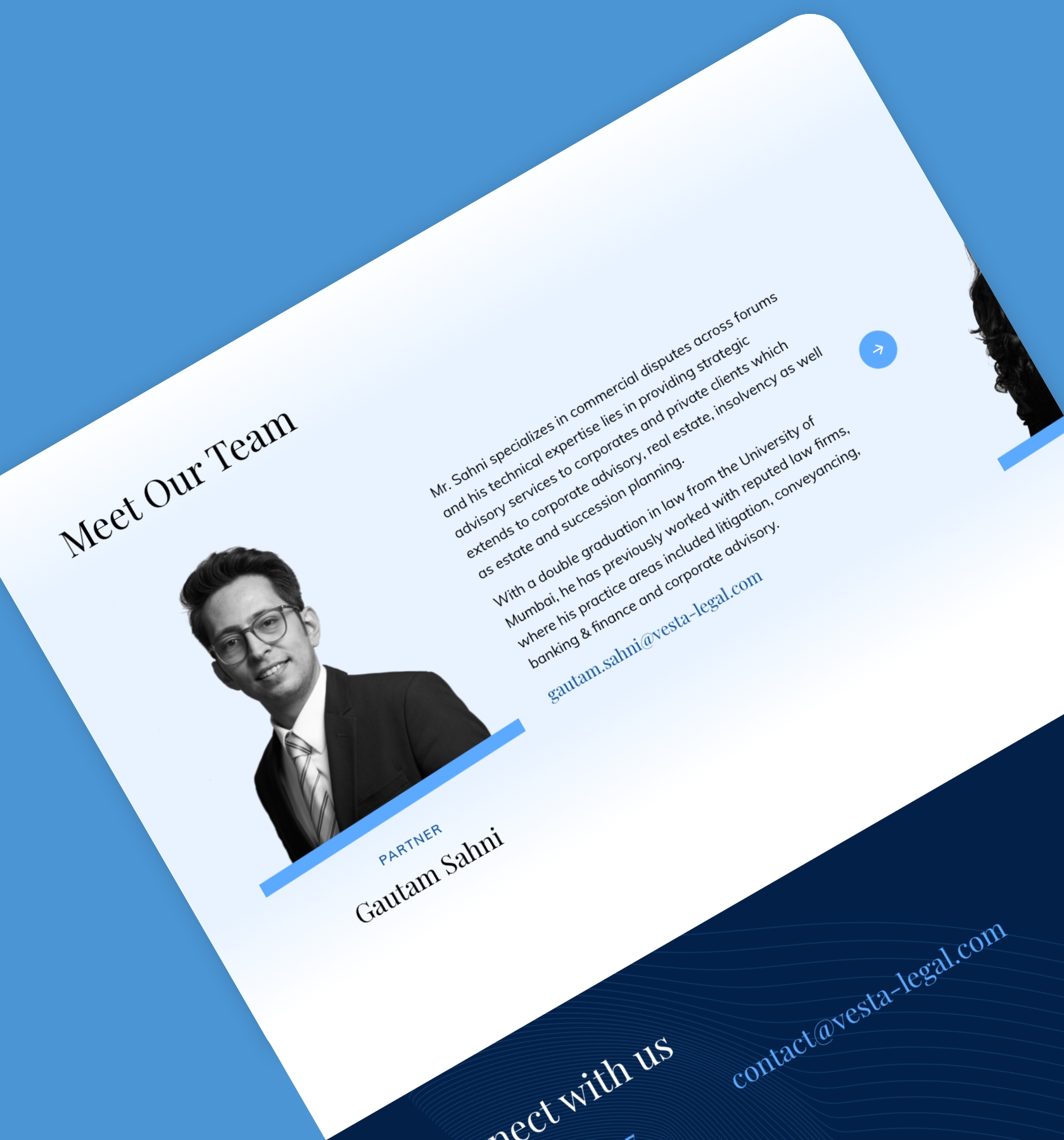
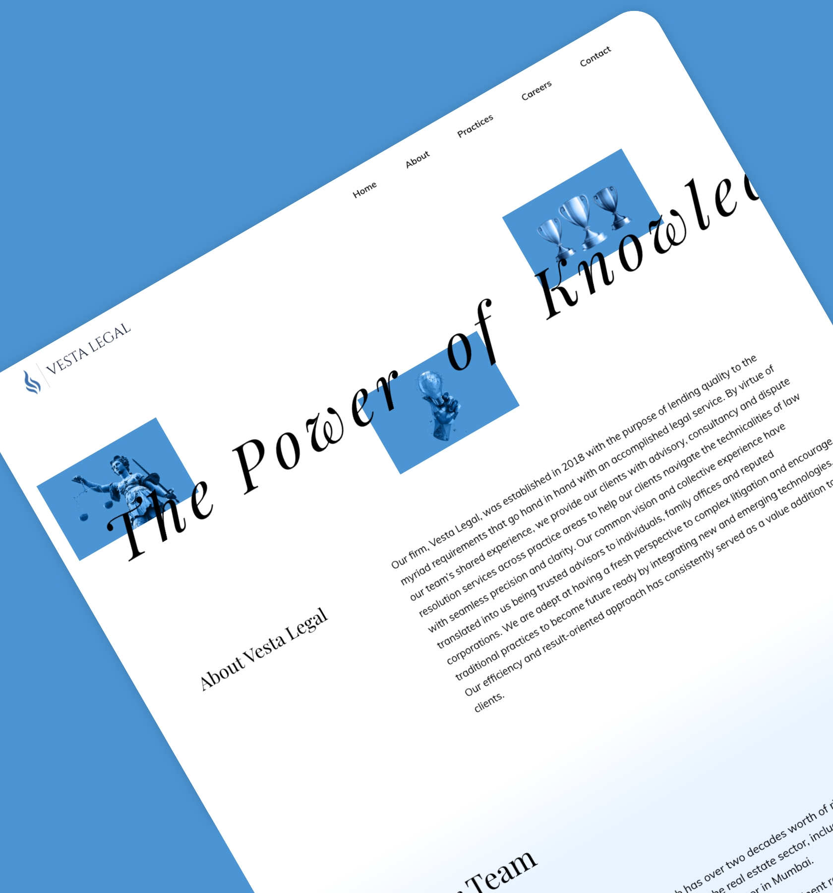
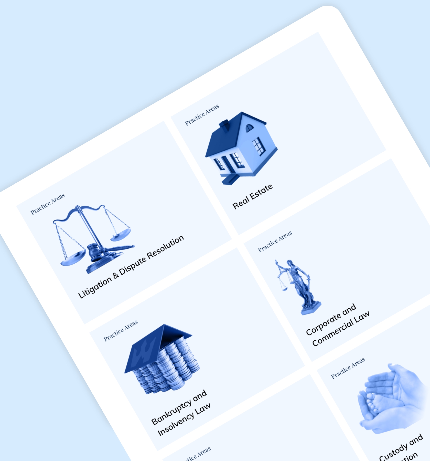
One of our clients, from the legal industry, embarked on a transformation journey recently, anticipating disruption from globalisation and rapid technological advances. Aside from wanting to shed the image of being an imposing, complex entity, they also wanted to encourage access to justice for the layperson. Generally, law firm websites have a lot of content and aren't that user friendly. Keeping this point in mind, we were tasked with creating a simple, yet modern, and future-oriented website.
We suggested that the client adopt a consumption mindset and start with the user journey. The users did not need to know the entities' entire workings to use the relevant legal guidance; they just had to identify the practice area they needed help with. The problem statement: What could we do to make it easier for users to find and understand information on a single website so that they can make informed decisions? Presenting multiple practice areas and achievements, while delivering a unified user experience, took nearly four months, albeit spread across two beta launches. Usability tests conducted with each beta launch validated what worked and highlighted areas for improvement.


